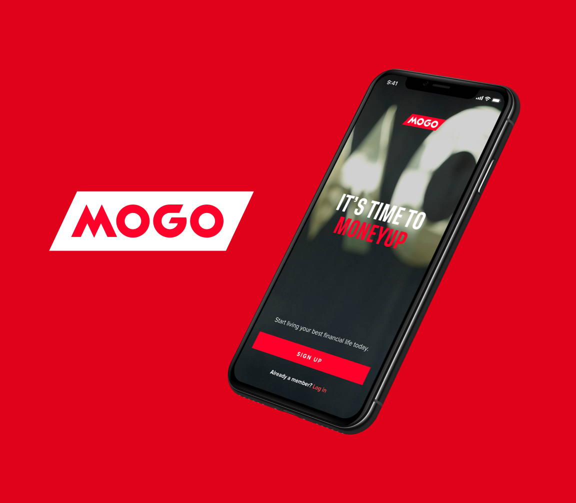
Improving navigation and unifying design for an HR platform
Rise People is an HRMS that unifies HR, Benefits, and Payroll into an easy-to-use, all-in-one platform, helping organizations manage all aspects of their business — from hiring and onboarding new talent to managing payroll, administering group benefits, and more.
To support the next phase of growth, I led the redesign of Rise's information architecture and a full UI unification across all core products, establishing a cohesive platform experience built on a comprehensive and modular design system.
Company
Rise People
Position
Senior Product Designer
Years
2020 – 2021

My role
As the Senior Product Designer on the platform team, I was tasked with unifying Rise People's various products around a cohesive platform experience through the creation of a comprehensive and modular design system. I was responsible for the end-to-end design of several platform-related projects, including multi-factor authentication, redesigning the platform's information architecture, and refreshing the UI of all core products.
I also helped fill the role of Product Manager for the UI unification project, working with the Director of Product to define scope, write product documentation, and contribute to shaping the release plan. I worked in collaboration with the CTO and Engineering Manager to ensure that scope was technically viable and would meet an end-of-May deadline, and tracked design progress through different project stages by creating a design roadmap.

The challenge
Rise People was originally built as a payroll platform that enabled clients to manage all aspects of their organization's payroll. As their client base grew, products like recruiting, benefits, people management, and time tracking were added to keep up with increased competition from platforms like Humi and Bamboo. However, this rapid expansion was done without proper planning, resulting in each product being built with its own unique set of UI patterns and user experience. This created several problems for both Rise and their clients:
Mental model disruption
Because each product was so unique, users had to continually readjust their mental model whenever they switched products. Navigating from HR to Benefits felt like an entirely new experience, causing frustration and additional cognitive load.
Perception of inconsistency
Different design languages across products made it hard for clients to picture Rise as an all-in-one platform. With increased competition, there was pressure to reduce churn and increase adoption by delivering a unified experience.
Engineering velocity
Maintaining multiple front-end codebases was slowing down the R&D team. Standardizing navigation and introducing reusable components would increase the speed of both design and development, creating more room for discovery and testing.
Through ongoing customer interviews, surveys, and user testing, we quickly identified that the biggest impact we could make to the user experience was to replace each unique navigation with centralized, component-based navigation. [Continue here…]


Methods
Rise People adopted elements of Basecamp's Shape Up framework, which involves “shaping” a project into a fixed 6-week time frame with a variable scope. While elements of Shape Up are clearly defined during the production phase, it doesn't account for design discovery very well — so I opted to incorporate aspects of the British Design Council's Double Diamond framework to bring clarity and research to the product from discovery through to developer hand-off.
Discovery
By talking to various clients we had a good understanding of the frustration that supporting multiple front-ends was causing our clients, users, and internal teams. This was further confirmed while conducting remote user testing sessions to validate our design direction, which was positively received by our test group.
See test resultsComponent audit
Conducted an audit of the existing navigation structure to uncover commonalities between the different navigation patterns.
Responsive layout studies
Defined breakpoints and standards for mobile, tablet, and web.
User flows & IA diagram
Created user flows and an information architecture diagram to communicate the new navigation structure to business stakeholders and platform engineers.
Design roadmap
Defined a staged approach to future design work related to our unification efforts.
User testing
Conducted remote user testing sessions with existing clients and documented these findings in a user testing report that could be shared throughout the organization.

Implementation
Once we had validated our direction and created a plan, we worked on scoping out the first iteration of the navigation structure, making sure we accounted for any existing dependencies. We wanted to make sure that our users would keep existing features, while also allowing for future enhancements.
Notifications
Product updates
Advanced search
Unified People Directory
Refreshed UI
Because we were introducing a new navigation structure and UI, we needed to ensure that the overall product experience would feel cohesive. However, we didn't have the time or resources to do a full redesign of each product. Instead, we focused on refreshing common elements like buttons, typography, colour, border-radius and shadows. We made minor improvements to the experience as long as it didn't add to the scope of the project.
As part of our UI unification efforts, I led a team that consisted of three product designers who were each responsible for applying our new set of UI patterns and standards to their respective products (Payroll, Benefits, and HR). This allowed me to focus on providing the team with feedback, ensuring that design system standards were adhered to and that work was delivered on time. I also acted as the primary point of contact for the external front-end engineers who were put on the project.


Results
Although this project is still in progress and set for release at the end of May, our test results proved that the new navigation was a drastic improvement over the existing experience. Feedback from those who tested the new navigation was overwhelmingly positive, and many asked when it would be available. As a way to provide a quantitative measurement of our test results, I used the System Usability Scale which uses a standard set of questions to provide a score based on ease of use and learnability of the product. Our new navigation structure received an average test score of 89.5/100, a score that exceeds user expectations.