Modernizing the Design System and Elevating Platform Experience at AgencyAnalytics
AgencyAnalytics is a reporting and analytics platform built for marketing agencies. It lets agencies aggregate client data across channels, build branded dashboards, and automate report delivery, making it easier to communicate impact to clients without burning hours on manual work.
When I joined, the business was pushing toward an ambitious all-in-one platform strategy, but years of rapid feature development across multiple teams had left the platform feeling disjointed. There was no unified design language, the information architecture had grown organically in ways that no longer served users, and what passed as a design system was closer to a UI kit. The opportunity was to bring cohesion to a platform that had outgrown its foundations.
Company
AgencyAnalytics
Role
Staff Product Designer
Years
2025 – 2026

My role
I joined AgencyAnalytics as a Staff Product Designer, co-leading the design systems team in collaboration with the Staff Front-End Engineer. I worked at the intersection of design and engineering, collaborating with both groups to ensure changes made to the system added value and scaled it rather than introducing unnecessary variation and overhead.
Our other mandate was to improve experiences across the platform. Platform improvements fed back into the system, and system work shaped how those experiences were designed. I worked closely with the Director of Product Design and Founders to align stakeholder expectations with user data. Working within a founder-led culture often meant design decisions moved fast and stakeholder involvement was high.
Results
2×
Increased component parity from 40% to 80%
8 → 0
Reduction in nav/IA related CX issues the following quarter (Q1, 2026)
30
NPS
Highest score since January 2025, following UX/UI improvements
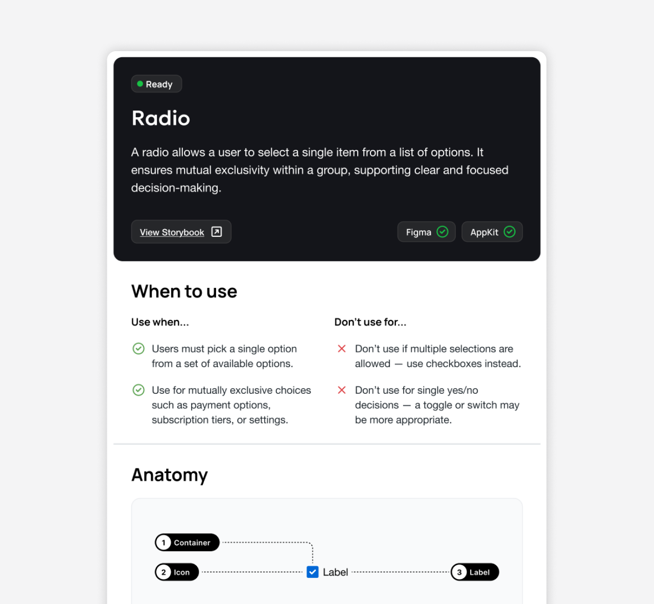
Scaling the design system
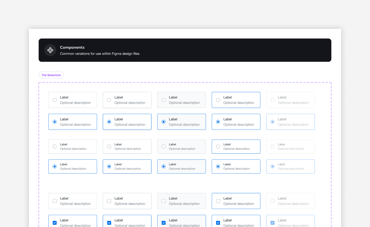
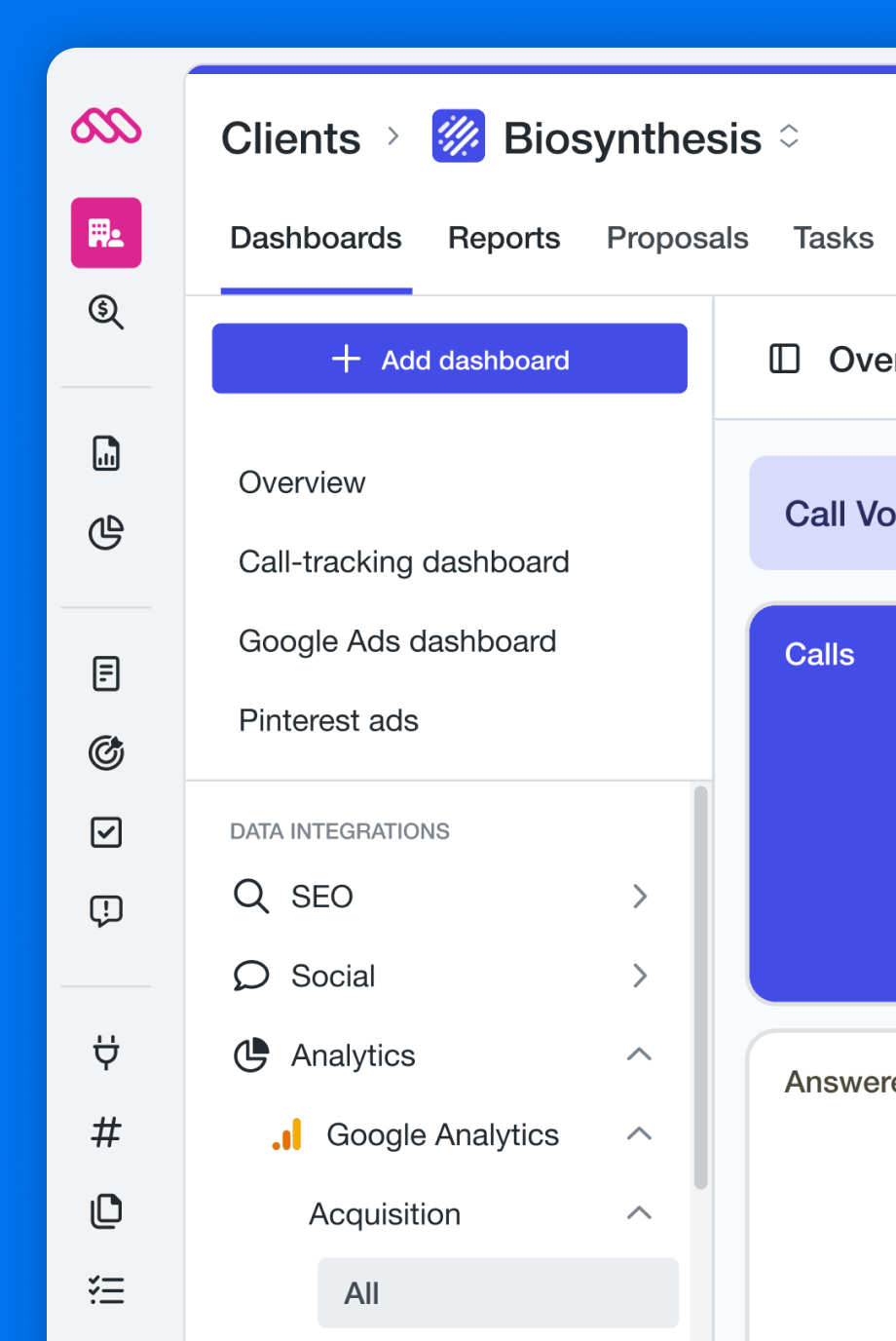
What existed when I arrived was closer to a UI kit than a design system. Components existed, but coverage was inconsistent. Only about 40% of the product had reached component parity, and many components hadn't been refactored in a way that made them efficient to work with.
Engineering had already begun auditing the platform, and I quickly jumped in with my own interface inventory to push it further. Running parallel audits gave us a clearer, more complete picture of where the gaps were. We collaborated with designers in each product area to understand how they prioritized components, which helped us determine what to refactor first and where to focus parity work.
Refactoring toward parity
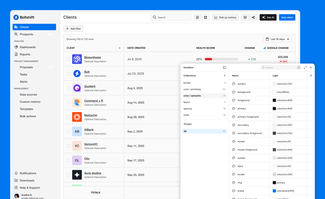
With priorities established, the focus shifted to refactoring. We rebuilt key components for flexibility and reuse, aligning Figma variables with our existing styles and laying the groundwork to scale to a new token system when the time came. This pushed component parity from 40% to roughly 80%. We balanced improvements tied to what product teams were actively shipping with a backlog focused on more holistic updates.
As the company shifted toward AI integrations, we pivoted from a bespoke token setup to Tailwind and shadcn, systems that AI platforms were already familiar with. I expanded on the existing foundation to adopt Tailwind's primitive token structure and shadcn's semantic token layer, giving the system a more flexible and scalable base going forward.
Feedback loops and process
Because of the nature of design systems and their reuse across teams, directly measuring impact to velocity is difficult. To help us track progress and adoption, I introduced a Design System Usability Survey to measure sentiment across engineering and design.
What we uncovered
The design system wasn't negatively impacting delivery times — teams felt it was actively helping with velocity
Newly refactored components were easier to work with than older ones, which still felt too rigid
The system lacked documentation and guidelines on when and how to use components
On the process side, we streamlined a number of processes to fit within the existing PDE lifecycle. These allowed us to get ahead of design work and operate in parallel, reducing one-offs and duplicate streams before they reached development.
Bi-weekly design system alliance meeting
Bi-weekly 1:1s with designers
Design system review before dev hand-off
User-focused platform improvements
When the initial navigation redesign launched, reception was mixed. Using Marvin, Intercom, and direct conversations with the CX team, I dug into the qualitative feedback to understand what wasn't working. From similar feedback, we also knew that users felt the platform was starting to feel dated. We brought both sets of findings to stakeholders and moved quickly to address them, using a recurring founder meeting to quickly get signoff.
Improve discoverability of key features and functionality
Reduce cognitive load caused by lesser-used features and functionality
Reduce click fatigue and improve IA when navigating between dashboards
Modernize the look and feel of the platform
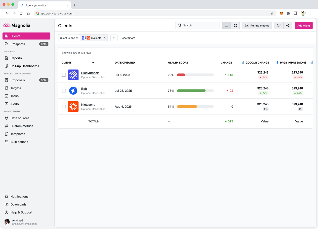
Client profile improvements
Addressing the first two focus areas, we restructured the client profile to surface the features agencies relied on most: reports, dashboards, integrations, and users, while pulling back the prominence of lesser-used functionality like tasks, goals, and alerts. The result was a profile that better reflected how agencies actually worked, reducing noise and making key actions easier to find.
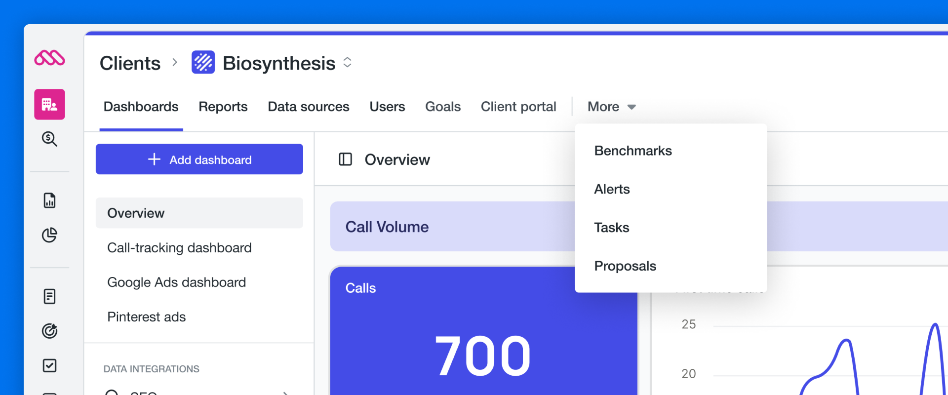
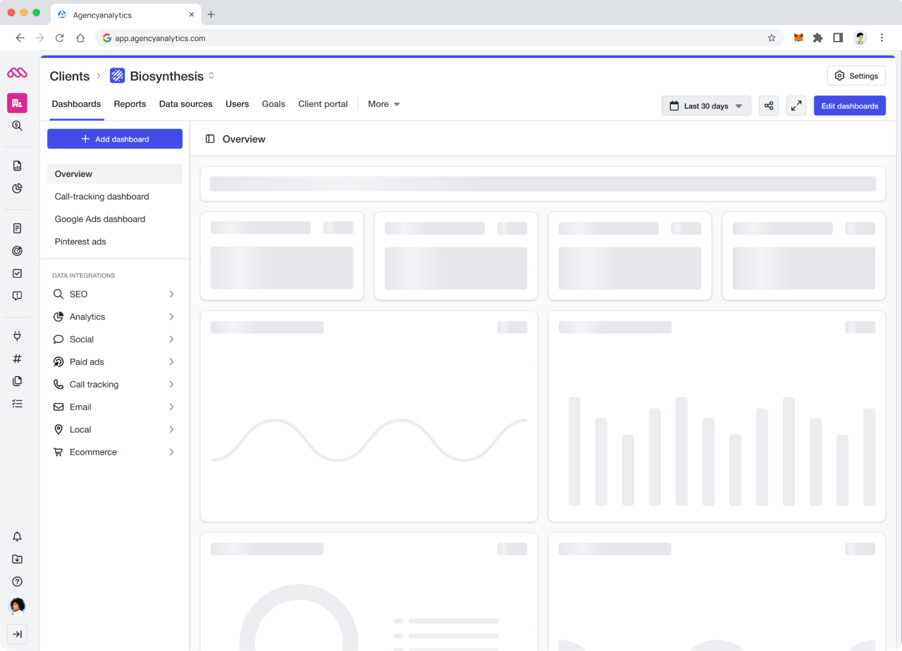
Dashboard navigation
To reduce click fatigue and improve how users moved between dashboards, we redesigned the dashboard navigation and overhauled interaction states. We also reintroduced a clearer separation between custom and integration dashboards, a change directly informed by user feedback that the flattened structure was making it harder for agencies and their clients to navigate and track performance.
CX support tickets related to navigation dropped from 8 in the previous quarter to 0 the quarter following this work.
Platform modernization
Working with the CPO, the design systems team drove a platform-wide UI refresh to address the sentiment that the product felt dated. This included a new primary navigation and header restructure, a refreshed UI canvas area, a new filter experience, and polish updates across typography and spacing. We also overhauled the skeleton loading experience and streamlined the download flow, changes that brought the platform up to a more modern standard and were met with positive feedback from users.
Outcomes
The work at AgencyAnalytics left the platform in a meaningfully better place — a more cohesive experience, a scalable design system, and stronger foundations for the team to move faster and more consistently. The results spoke to that: NPS reached its highest point in over a year, component parity doubled, and engineers noted the newer components were substantially better to work with.